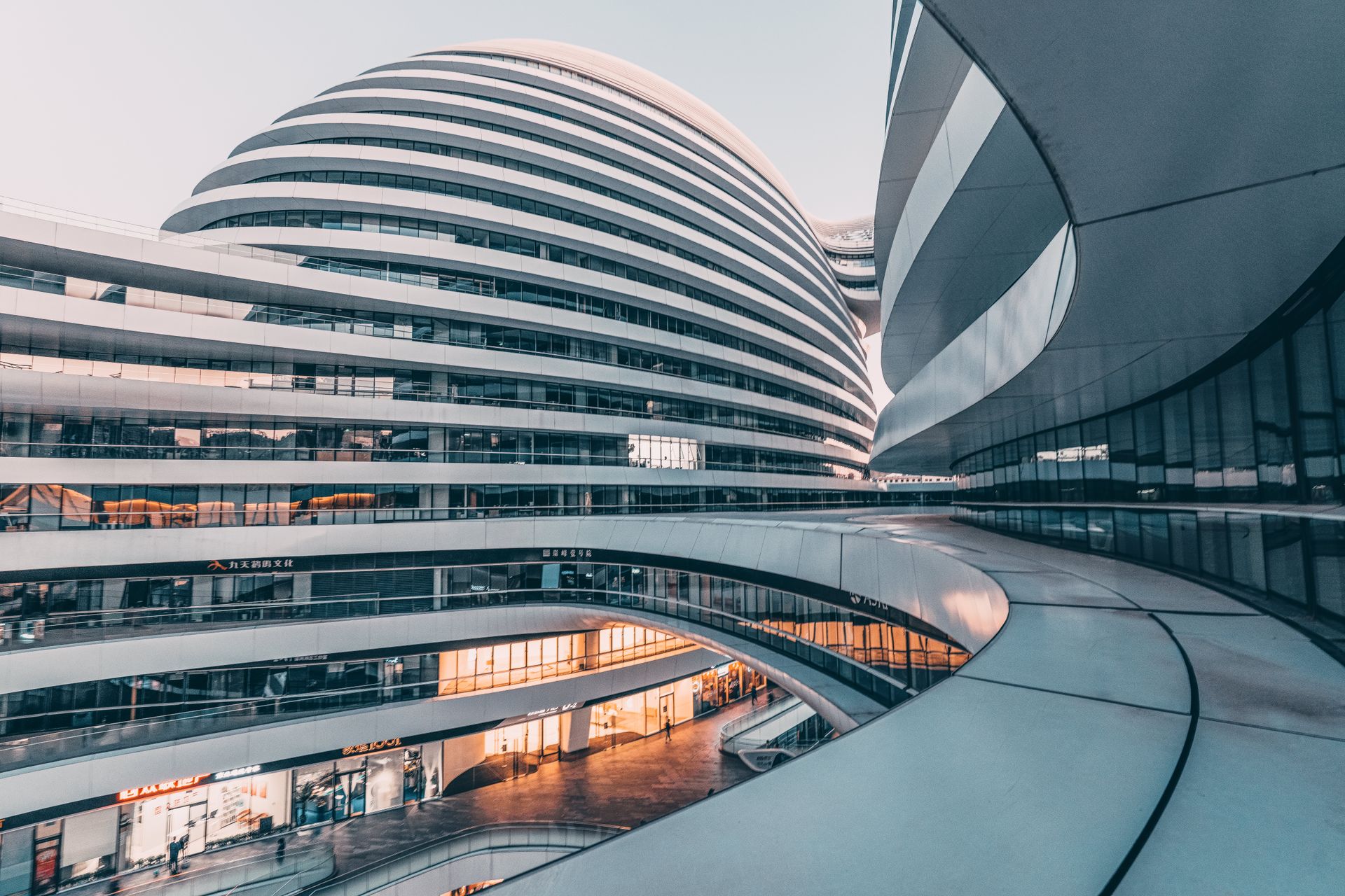
Field Notes
A digital identity and editorial platform for a multidisciplinary creative studio — built around process, people, and the stories behind the work.
Web Designer & Developer
Field Notes
November 3, 2026
Too much work. Not enough story.
The studio had a strong body of work, but its previous site treated every project like a static image archive. The challenge was to create a portfolio that could reveal the thinking, process, and people behind each project without making the experience feel heavy.
- Create stronger narrative hierarchy.
- Keep the interface minimal and image-led.
- Make long case studies easy to scan.
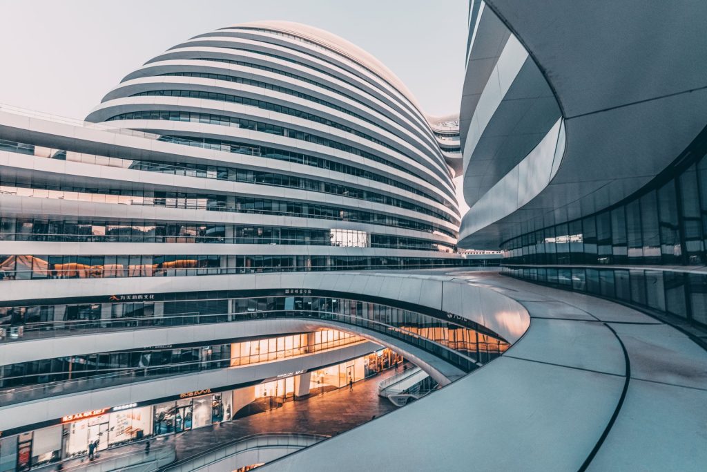
Turn every project into a sequence.
Instead of a conventional gallery, each case study follows a chapter-based flow. Text, process imagery, results, and large visual moments alternate naturally, giving the reader a reason to keep moving through the page.
- Sticky chapter navigation.
- Alternating text and image rhythm.
- Quiet transitions and controlled spacing.
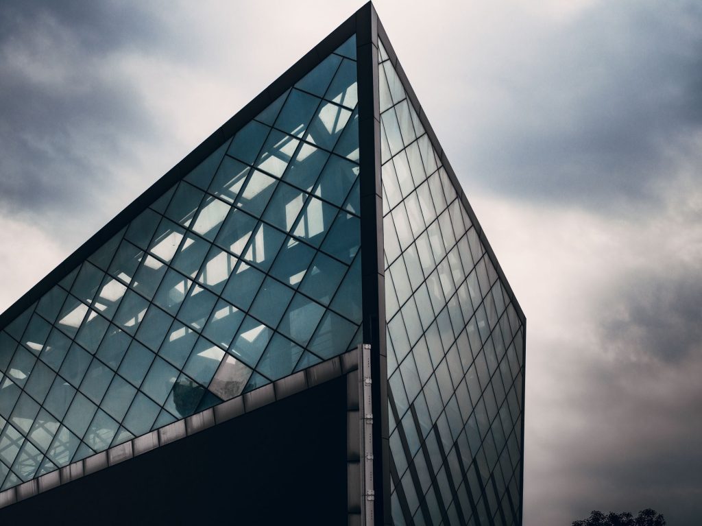
One flexible system. Many stories.
The layout was designed as a reusable content system. Each project can be short or extensive, but the visual language remains consistent through the same typography, spacing, border treatment, and modular content blocks.
- Shared CPT portfolio fields.
- Reusable gallery and information blocks.
- Responsive composition from desktop to mobile.
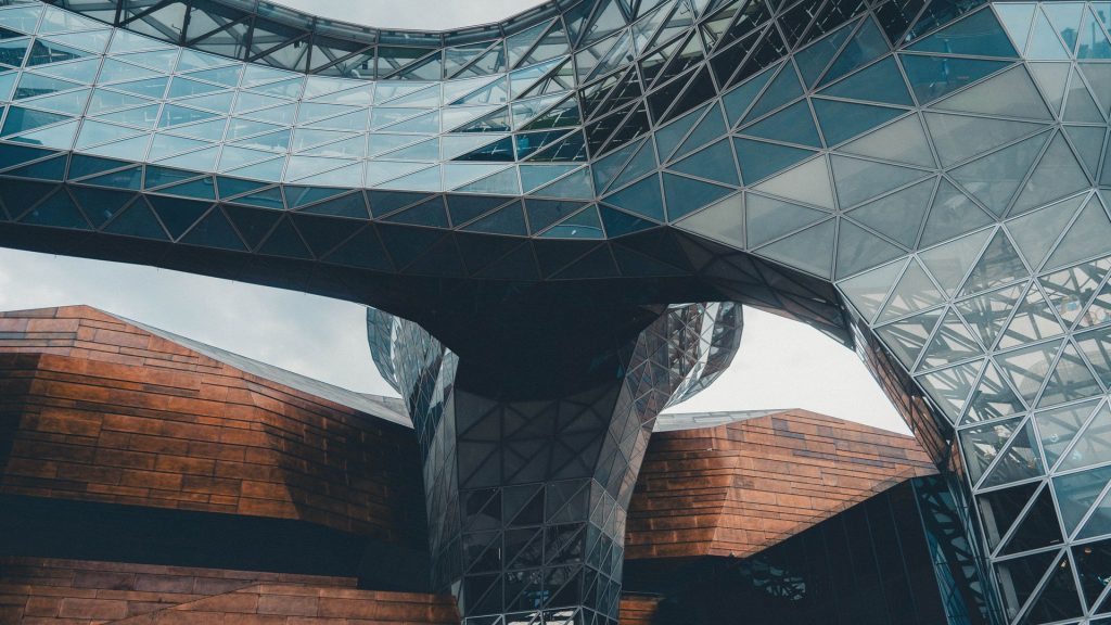
More clarity. More depth. Less noise.
The final experience feels closer to an editorial feature than a conventional portfolio page. Visitors can quickly understand the project, but those who want more context can follow the full story from challenge to outcome.
- Longer case-study engagement.
- Stronger project differentiation.
- A clearer premium studio positioning.
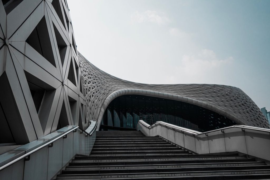
What changed.
A quieter interface gave the content more presence while making complex project stories easier to understand.
Click to view
“The new portfolio finally explains how we think — not only what we make.”