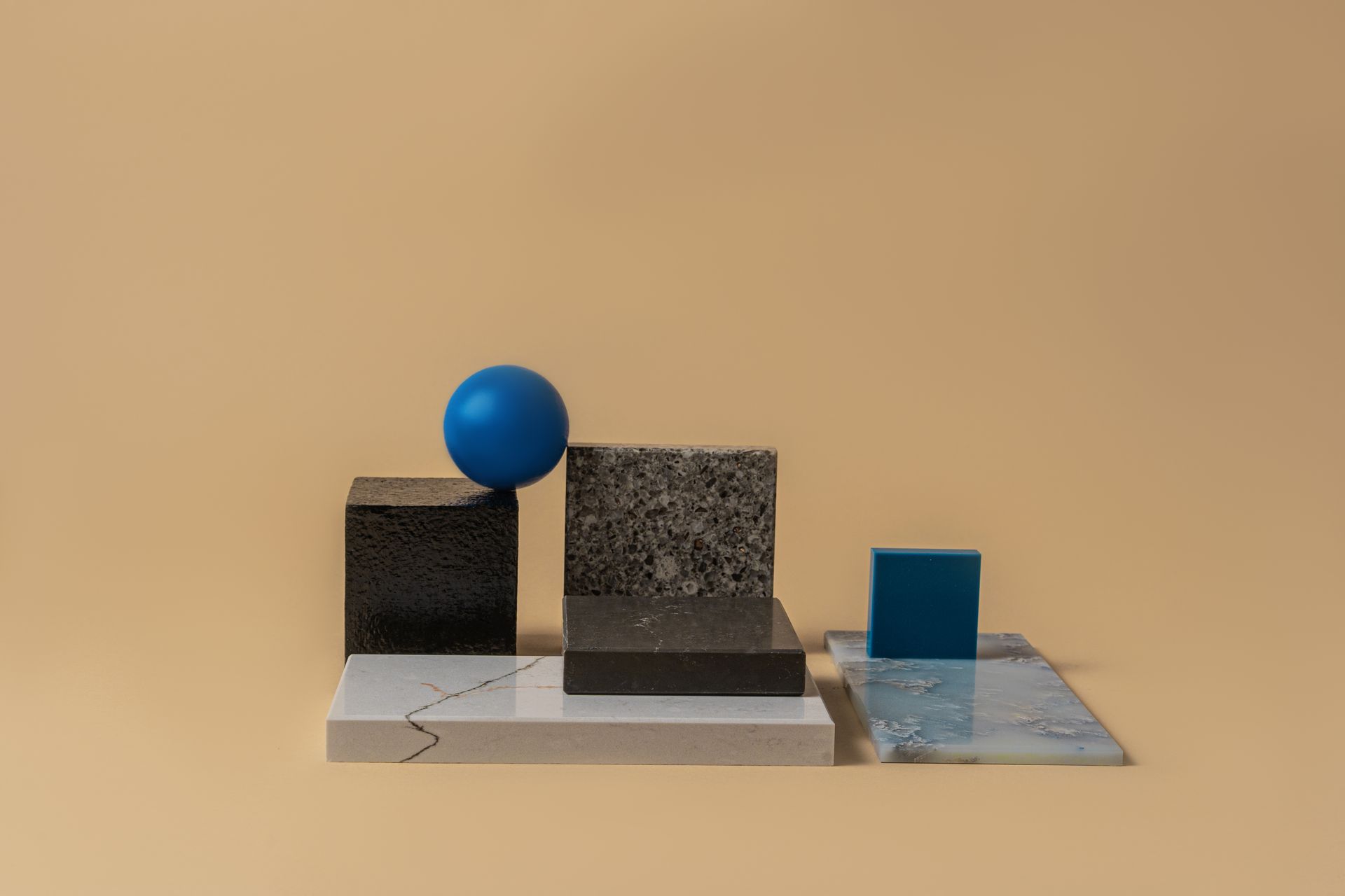
Maison Elan
A quiet digital identity for an independent interior studio — shaped around warm materials, timeless typography, and editorial rhythm.
Maison Elan
A restrained visual system made to let the work speak first.
Maison Élan needed a portfolio that felt calm without becoming empty, sophisticated without feeling cold. The visual direction combines deep black, warm gold accents, tactile imagery, and measured spacing — creating a presence that feels deliberate from the first scroll to the final project detail.
Clarify the character.
We reduced the visual language to a focused set of colors, type, spacing, and image treatments.
Build the rhythm.
Editorial grids and generous negative space give every image and message room to breathe.
Keep it flexible.
The system remains modular, responsive, and easy to extend across new case studies.
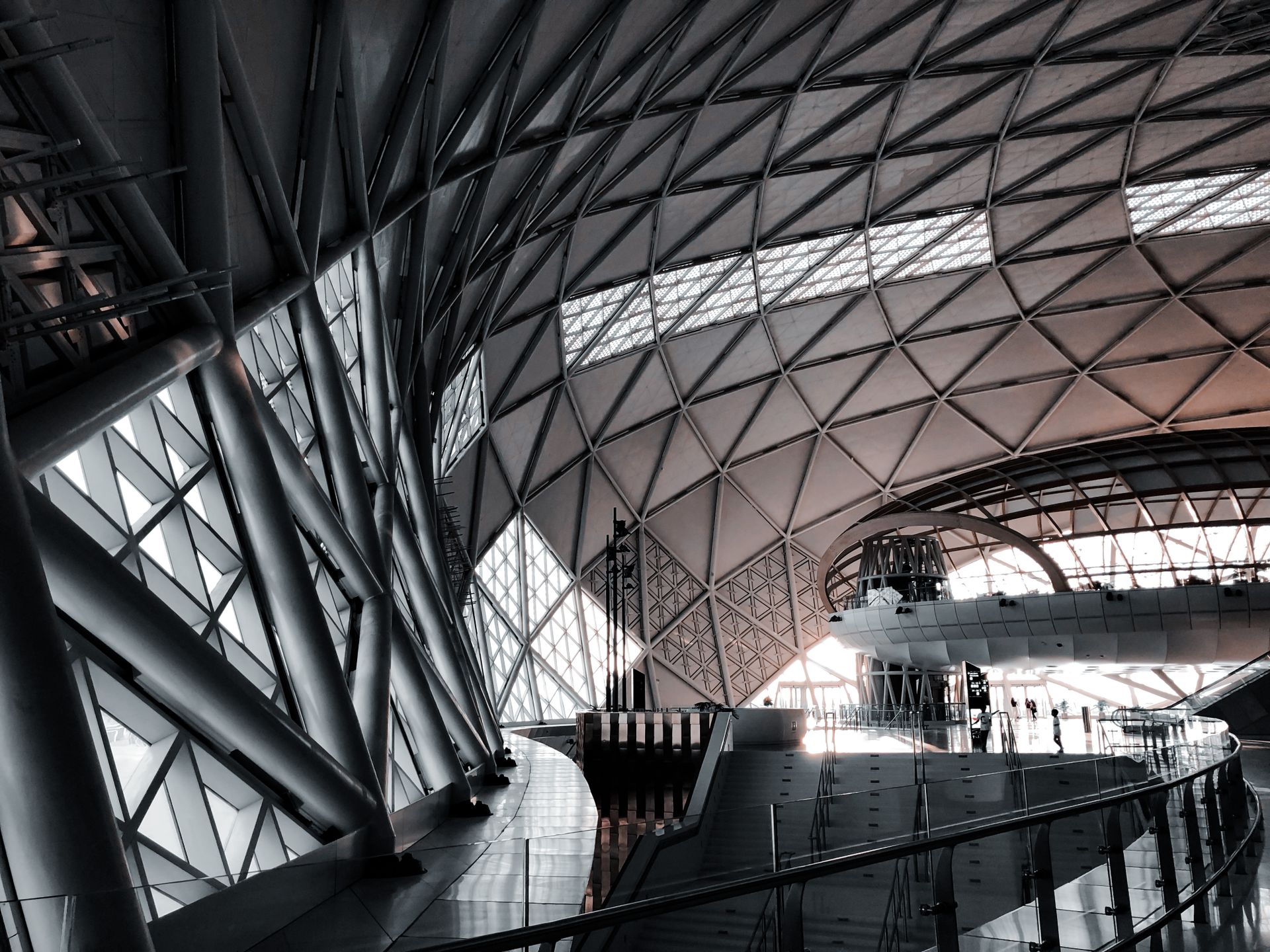
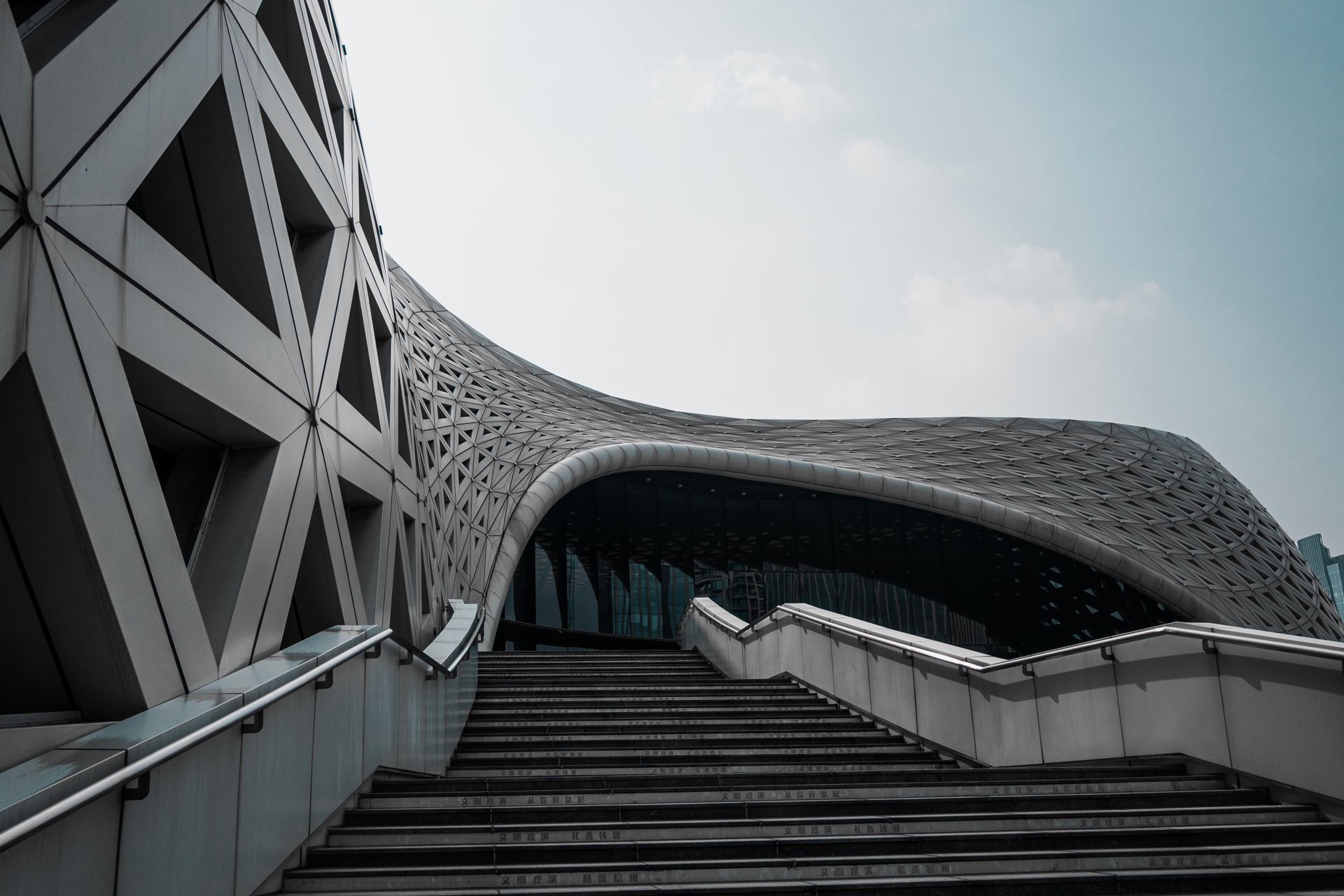
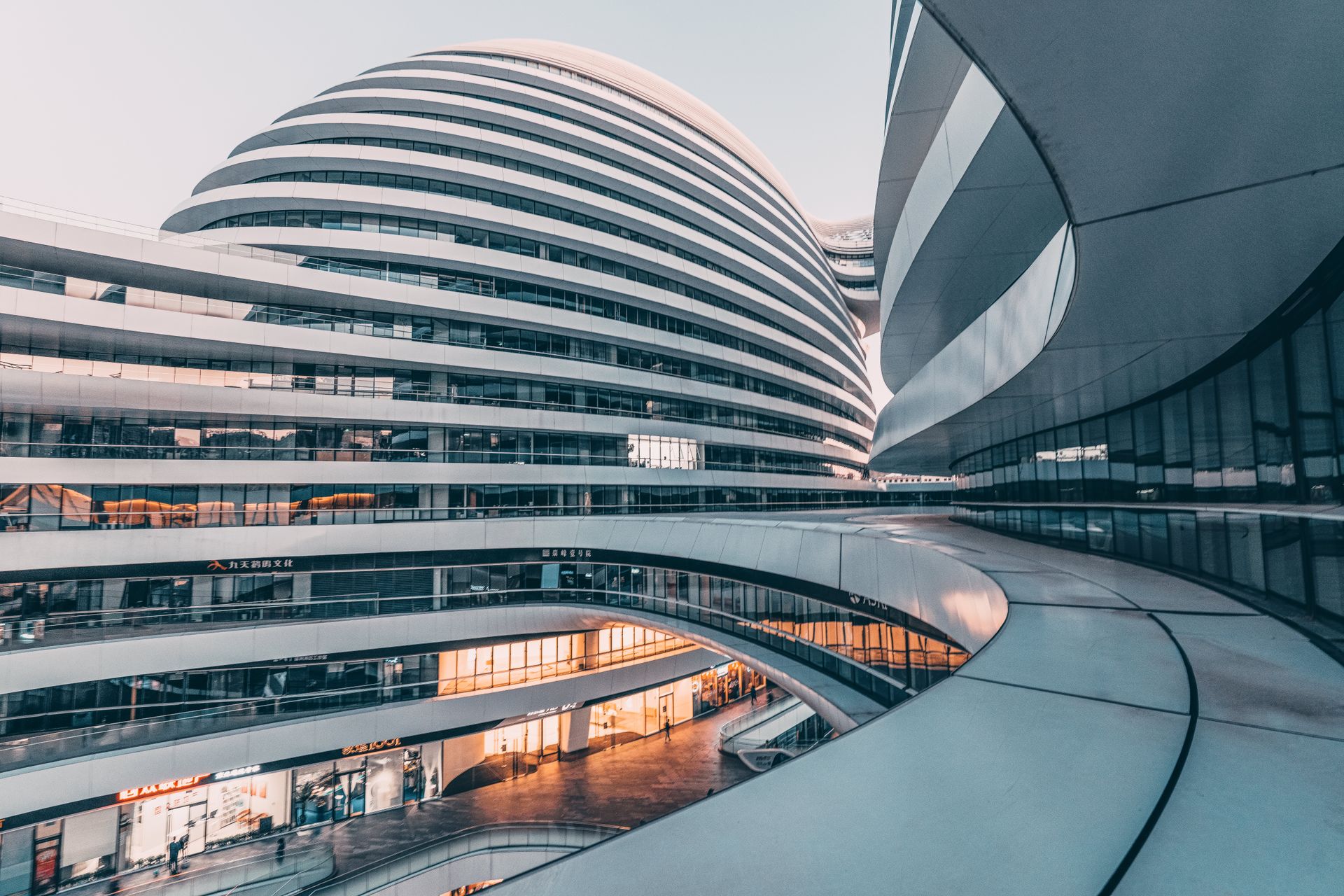
Selected Gallery
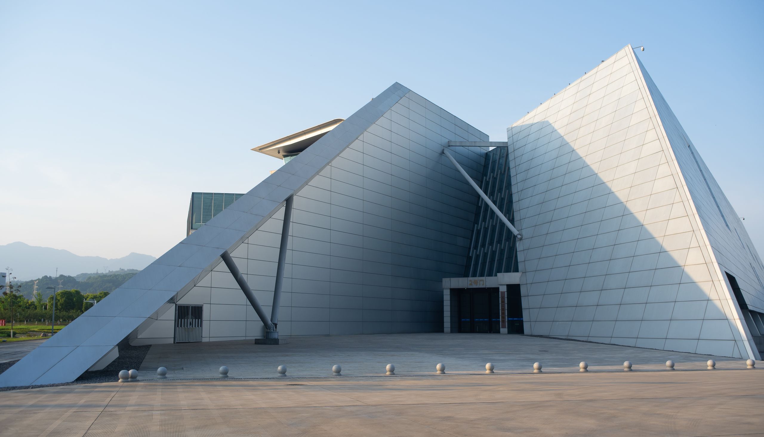
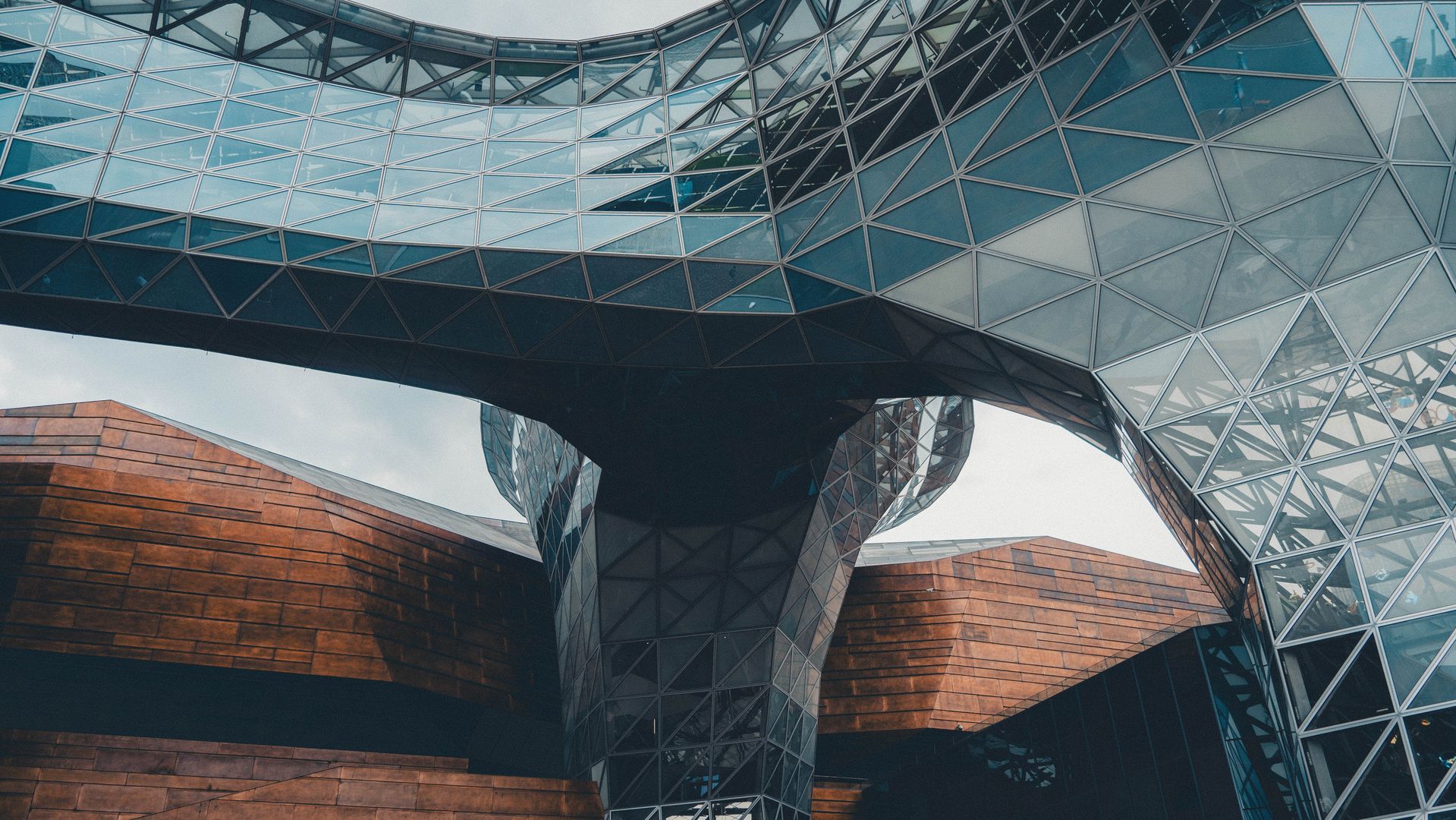
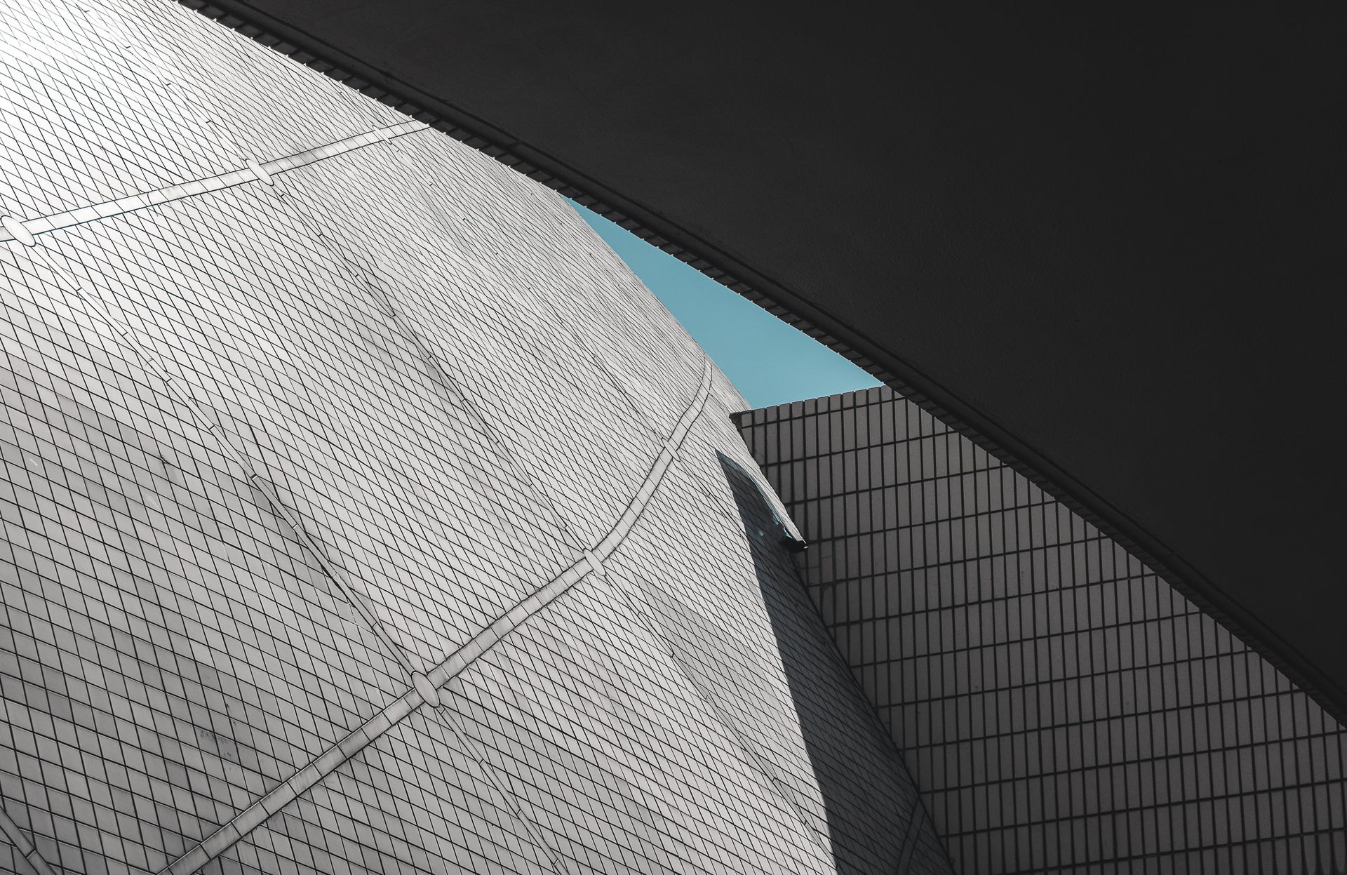
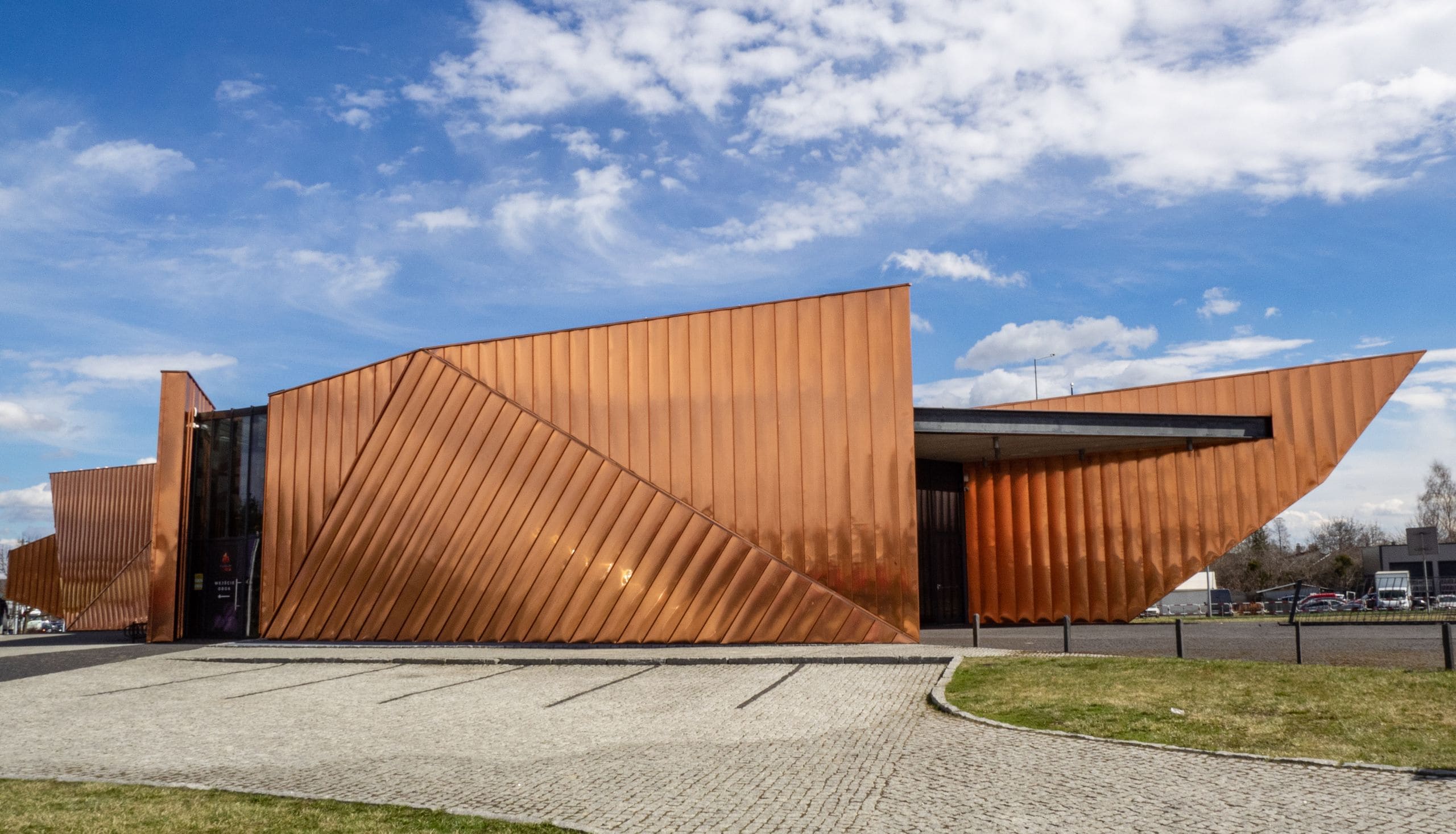
Asymmetric image blocks keep the layout editorial while the 12px radius and thin borders preserve the Karnanda character.
Project Information
Made with intention.
The same content model can power every Karnanda single portfolio layout. Only the presentation changes — making the theme flexible without fragmenting its identity.
“It feels quiet, warm, and deliberate — exactly how we want people to experience our work.”